The challenge


Since the onset of the pandemic, there has been an unexpected shift in work-life balance, giving rise to more workers who work remotely.

Currently, there are various methods for finding a place to work remotely, but there isn't a specialized app for this purpose. As a result, users resort to using more general apps or methods, like Yelp or Google, to locate suitable workspaces.

How can we create an app specifically tailored for finding workspaces?


What features and components can we include to make this app more focused on discovering suitable locations to Post-Up?

The idea


The goal of this app is to create a app that help users more easily find public spaces conducive for work

Timeline


January 1, 2024 - January 6, 2024

Role


UX Designer and UX Researcher

The challenge


Since the onset of the pandemic, there has been an unexpected shift in work-life balance, giving rise to more workers who work remotely.

Currently, there are various methods for finding a place to work remotely, but there isn't a specialized app for this purpose. As a result, users resort to using more general apps or methods, like Yelp or Google, to locate suitable workspaces.

How can we create an app specifically tailored for finding workspaces?


What features and components can we include to make this app more focused on discovering suitable locations to Post-Up?

The idea

The goal of this app is to create a app that help users more easily find public spaces conducive for work


Timeline

January 1, 2024 - January 6, 2024

Role


UX Designer and UX Researcher

Background

Day 1

Map


Understand Needs and Painpoints


As I analyzed the project brief, it became clear that the app should prioritize remote workers' requirements. One interviewee highlighted that accessing information about available spaces is readily available, but the current process is cumbersome. Understanding the need to simplify the space evaluation process for users, I identified essential amenities like Wi-Fi, bathrooms, and outlets.

Day 2

Inspiration
Yelp

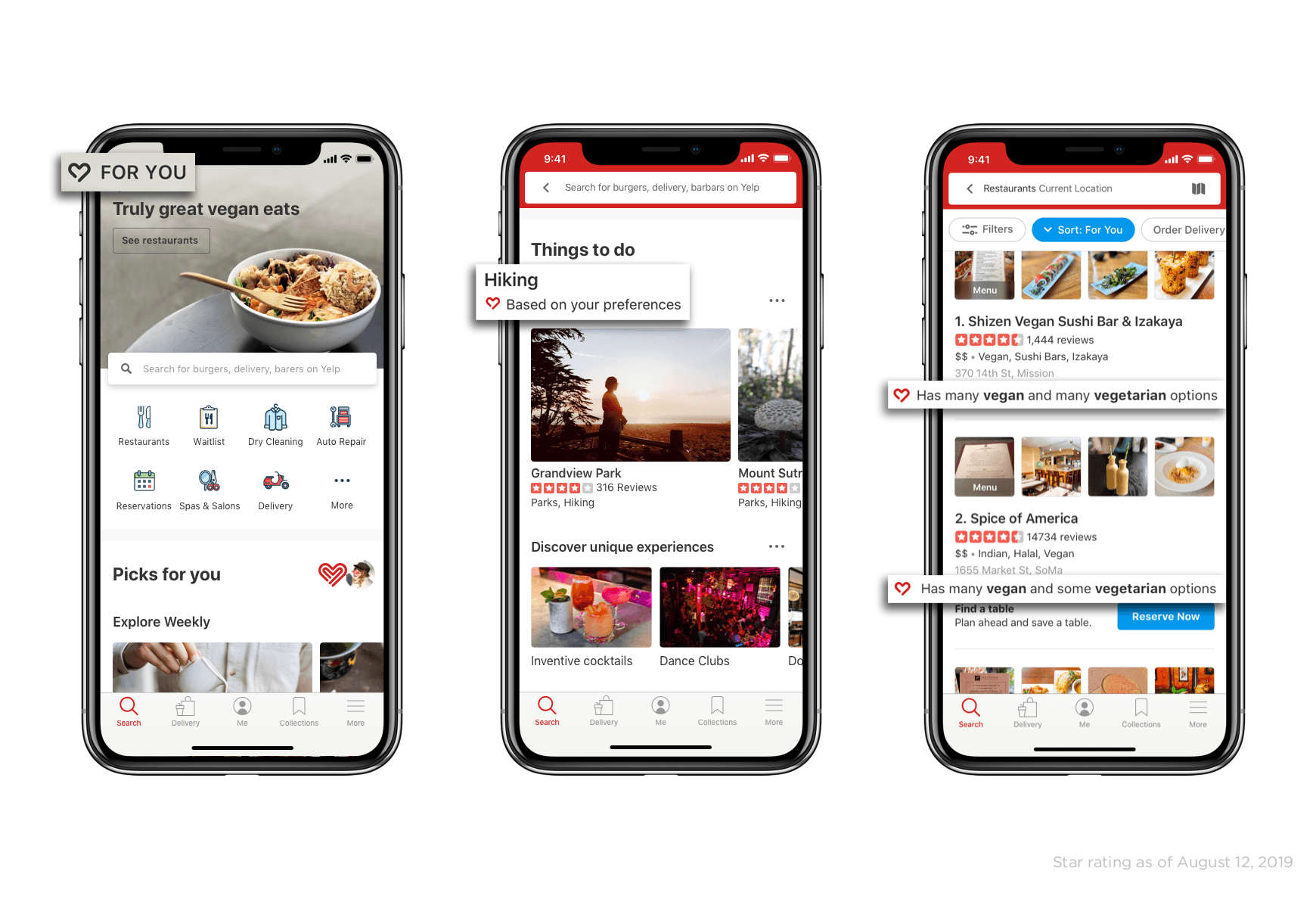
On the second day, I was inspired by Yelp's successful approach in assisting users to identify public spaces or services. I pinpointed the necessity for select parameter fine-tuning, accentuating distinct characteristics and amenities so as to amplify the efficacy of our app in guiding users to appropriate public working locations. The elements considered were quantity of power outlets, restroom amenities, availability of outside seating areas, and the standard of Wi-Fi connectivity.

Day 2

Inspiration
Zillow

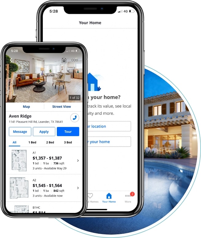
Moreover, I drew insights from apps like Zillow, which excels at visually presenting spaces through their floorplans. I believed that incorporating this element would add significant value, offering users a clearer understanding of the layout of public spaces and highlighting key features and components within them.
Day 2

Sketch

Crazy 8s

Moreover, I drew insights from apps like Zillow, which excels at visually presenting spaces through their floorplans. I believed that incorporating this element would add significant value, offering users a clearer understanding of the layout of public spaces and highlighting key features and components within them.

Day 2

Sketch

Crazy 8s

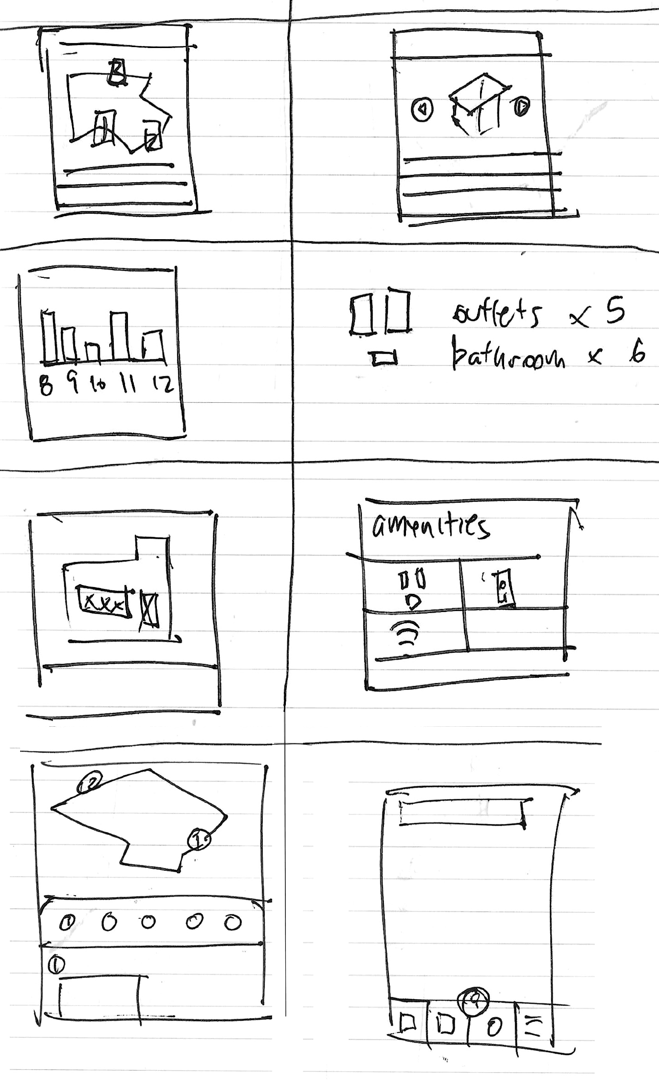
On Day 2, during my Crazy 8s session, I concentrated on sketching individual components and features rather than entire screens for my app. Among the various brainstormed features, the most crucial one identified was the floorplan. This feature stands out as a key component because it provides users with additional context to evaluate the suitability of a workspace beyond just a simple overview of the space. Additionally, I acknowledged the importance of integrating an indicator to show the hourly level of "busyness" in a given space.


Day 2

Sketch

On Day 2, during my Crazy 8s session, I concentrated on sketching individual components and features rather than entire screens for my app. Among the various brainstormed features, the most crucial one identified was the floorplan. This feature stands out as a key component because it provides users with additional context to evaluate the suitability of a workspace beyond just a simple overview of the space. Additionally, I acknowledged the importance of integrating an indicator to show the hourly level of "busyness" in a given space.


Crazy 8s

The challenge


Since the onset of the pandemic, there has been an unexpected shift in work-life balance, giving rise to more workers who work remotely.

Currently, there are various methods for finding a place to work remotely, but there isn't a specialized app for this purpose. As a result, users resort to using more general apps or methods, like Yelp or Google, to locate suitable workspaces.

How can we create an app specifically tailored for finding workspaces?


What features and components can we include to make this app more focused on discovering suitable locations to Post-Up?

The idea


The goal of this app is to create a app that help users more easily find public spaces conducive for work


Timeline


January 1, 2024 - January 6, 2024

Role


UX Designer and UX Researcher


Day 3

Decide

Create a Storyboard

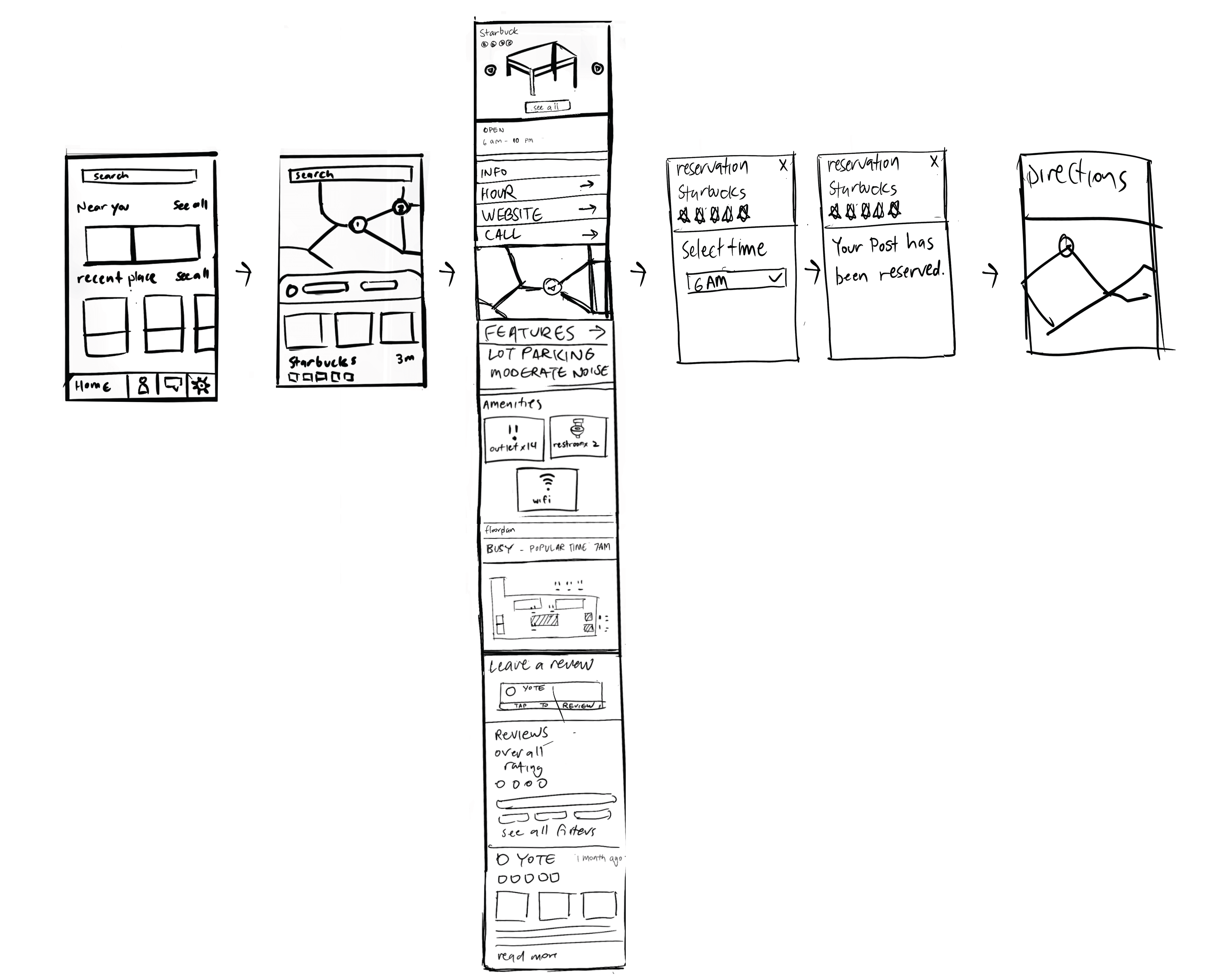
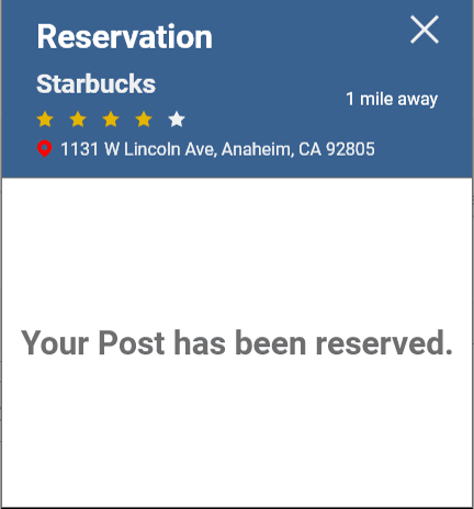
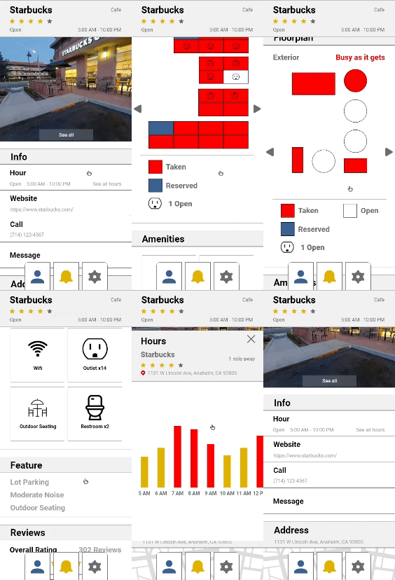
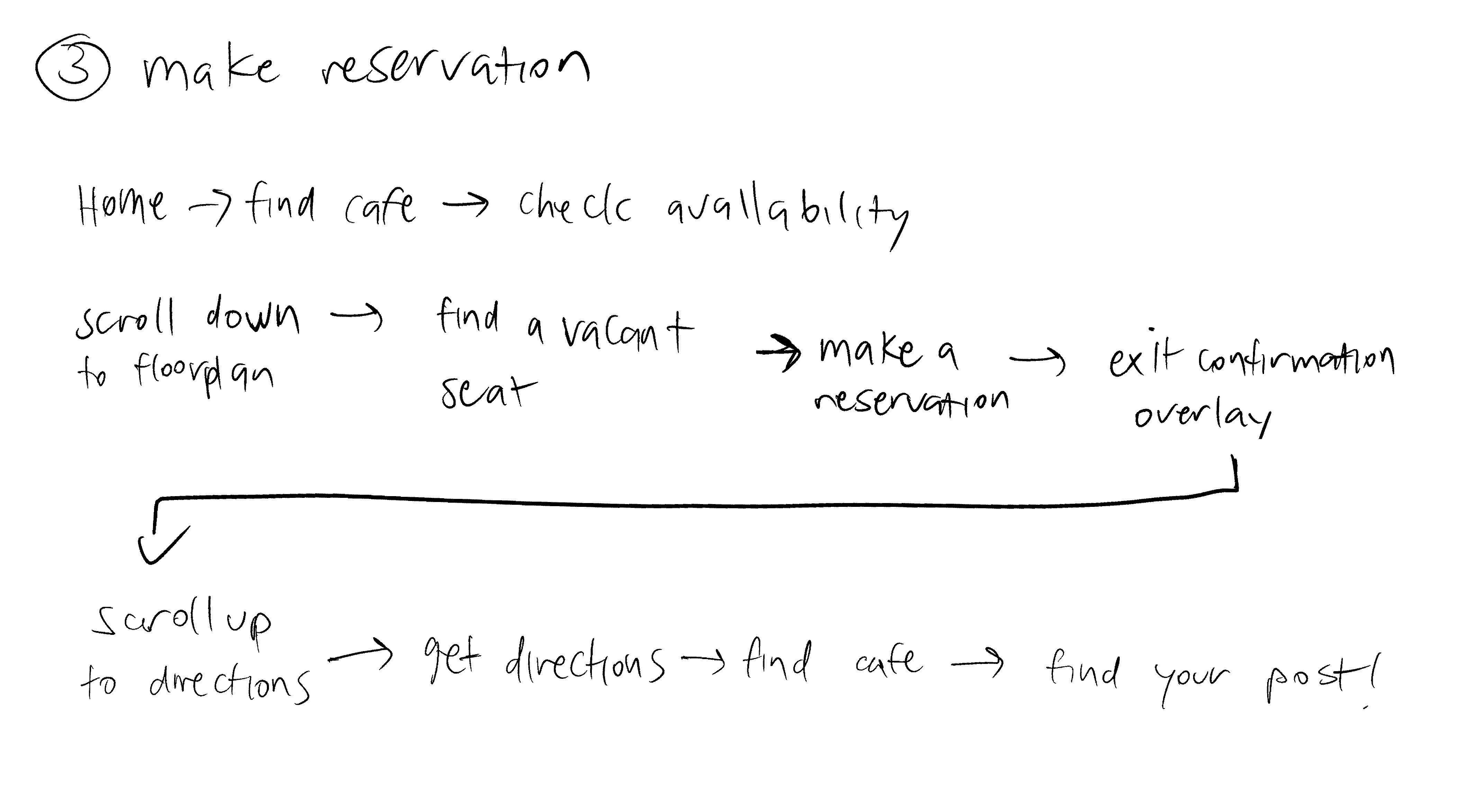
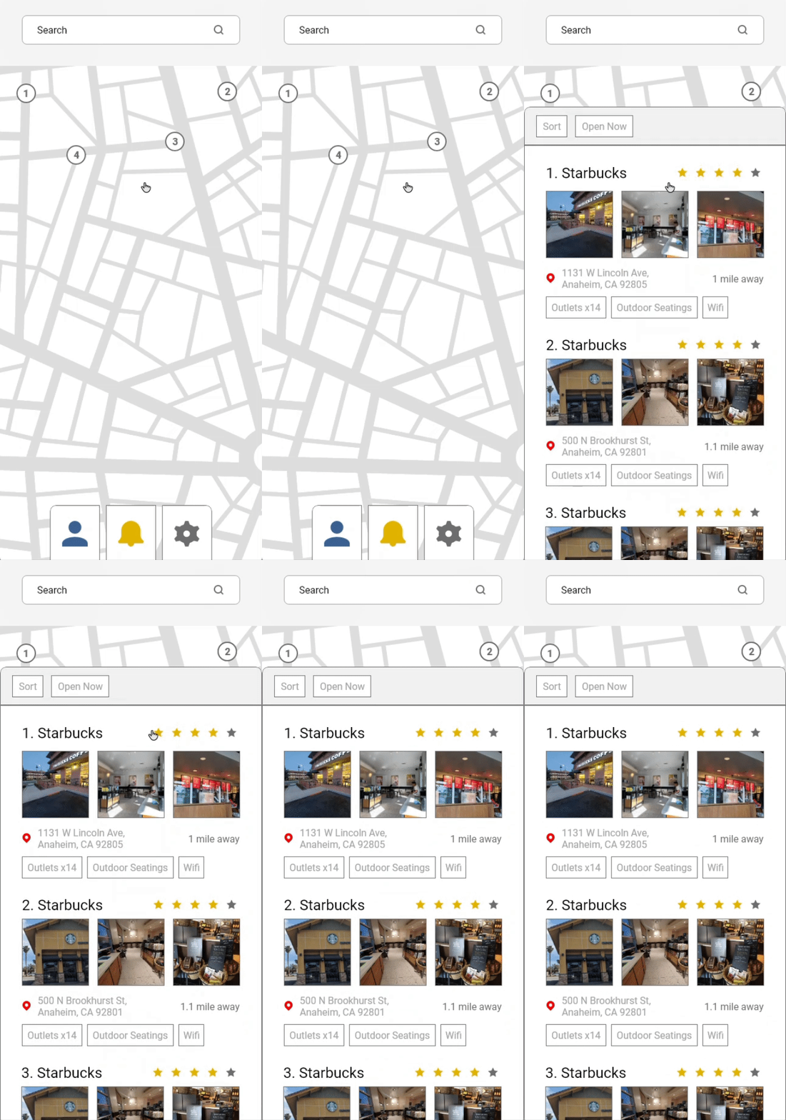
In developing my solution, I identified the reservation pattern as the key feature for my app. With this in mind, I chose a reverse engineering approach, starting the design process from this pivotal feature. The first step involved creating the floorplan component, where users would make reservations after selecting a spot to 'post up.' After establishing this component, I designed a "location page" containing essential information about the spot, such as hours, address, and amenities.

Once the location page was in place, I worked backward to create a search result page displaying all available locations. Drawing inspiration from Yelp's search result page, I aimed to incorporate a similar pattern. Yelp allows users to view results either in a list or on a map, with these options easily interchangeable.

Subsequently, I designed a basic home screen featuring different spaces, a search bar, and nearby spaces. This home screen facilitates user exploration, enabling them to discover spaces in their vicinity or directly search for a specific location using the search bar.
Day 4

Lo-Fi Prototype

Create a Framework


My prototype consists of three fundamental components: the home page, search results page, and a location page. Given the brief nature of this sprint, my aim was to establish the skeletal framework of the app.

Features Highlighted from Interviews

The home page was easy to prototype, aiming for a clear and easy-to-understand layout.

For the search results page, I focused on setting my app apart from others like Yelp. Insights from interviews informed this step, showcasing key features and amenities conducive to work. I included icons and numerical indicators to help users quickly compare amenities across different location

Day 5

Usability Test

Lack of Indicators


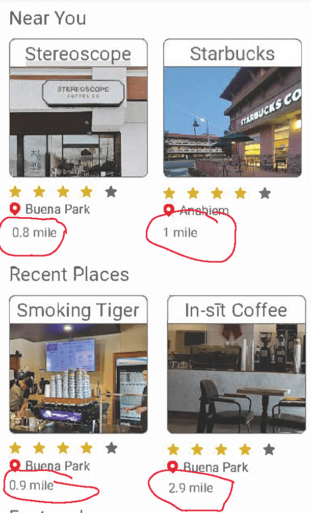
The test revealed key insights: participants found certain overlays, especially the "Sort By" feature, unclear, and noted minor issues like the absence of a clear exit option. A major concern was the lack of location indicators, causing confusion about proximity to selected spaces.

Lack of Confirmation

Additionally, users expressed uncertainty about the confirmation of actions due to a lack of interactive feedback

About

Versatile professional with experience in bakery operations, military service as an Navy Aviation Ordnanceman, and a Bachelor's in Product Design focusing on soft goods. Seeking to transition into UX design, merging creativity, technical skills, and a user-centered approach. Dedicated to delivering innovative solutions and enhancing user experiences across digital platforms.

Contact

Day 4

Lo-Fi Prototype

Create a Framework


My prototype consists of three fundamental components: the home page, search results page, and a location page. Given the brief nature of this sprint, my aim was to establish the skeletal framework of the app.

Features Highlighted from Interviews

The home page was easy to prototype, aiming for a clear and easy-to-understand layout.

For the search results page, I focused on setting my app apart from others like Yelp. Insights from interviews informed this step, showcasing key features and amenities conducive to work. I included icons and numerical indicators to help users quickly compare amenities across different location

Day 5

Usability Test

Lack of Indicators


The test revealed key insights: participants found certain overlays, especially the "Sort By" feature, unclear, and noted minor issues like the absence of a clear exit option. A major concern was the lack of location indicators, causing confusion about proximity to selected spaces.

Lack of Confirmation

Additionally, users expressed uncertainty about the confirmation of actions due to a lack of interactive feedback

Day 4

Lo-Fi Prototype

Create a Framework


My prototype consists of three fundamental components: the home page, search results page, and a location page. Given the brief nature of this sprint, my aim was to establish the skeletal framework of the app.

Features Highlighted from Interviews

The home page was easy to prototype, aiming for a clear and easy-to-understand layout.

For the search results page, I focused on setting my app apart from others like Yelp. Insights from interviews informed this step, showcasing key features and amenities conducive to work. I included icons and numerical indicators to help users quickly compare amenities across different location

About

Versatile professional with experience in bakery operations, military service as an Navy Aviation Ordnanceman, and a Bachelor's in Product Design focusing on soft goods. Seeking to transition into UX design, merging creativity, technical skills, and a user-centered approach. Dedicated to delivering innovative solutions and enhancing user experiences across digital platforms.

Contact

Day 5

Usability Test

Lack of Indicators


The test revealed key insights: participants found certain overlays, especially the "Sort By" feature, unclear, and noted minor issues like the absence of a clear exit option. A major concern was the lack of location indicators, causing confusion about proximity to selected spaces.

Lack of Confirmation

Additionally, users expressed uncertainty about the confirmation of actions due to a lack of interactive feedback

Conclusion

Conclusion

In conclusion, this project addresses the issue of inconsistent shoe sizing resulting from manufacturers deviating from established industry guidelines. The primary objective revolves around the creation of a specialized database designed to provide precise and easily accessible sizing information. Setting itself apart through the incorporation of inches and centimeters as metrics instead of traditional vague sizing, the database aims to simplify the research process. Insights from interviews played a pivotal role in refining the user experience, leading to the integration of a comparison feature for efficient product assessment. Usability testing proved instrumental in identifying and resolving key issues, including the removal of the multiple size function and a reworked comparison feature for enhanced accessibility. This project presented challenges in anticipating user behavior, emphasizing the importance of designing an intuitive and user-friendly product in addressing the complexities of footwear sizing.

In conclusion, this project addresses the issue of inconsistent shoe sizing resulting from manufacturers deviating from established industry guidelines. The primary objective revolves around the creation of a specialized database designed to provide precise and easily accessible sizing information. Setting itself apart through the incorporation of inches and centimeters as metrics instead of traditional vague sizing, the database aims to simplify the research process. Insights from interviews played a pivotal role in refining the user experience, leading to the integration of a comparison feature for efficient product assessment. Usability testing proved instrumental in identifying and resolving key issues, including the removal of the multiple size function and a reworked comparison feature for enhanced accessibility. This project presented challenges in anticipating user behavior, emphasizing the importance of designing an intuitive and user-friendly product in addressing the complexities of footwear sizing.

About

Versatile professional with experience in bakery operations, military service as an Navy Aviation Ordnanceman, and a Bachelor's in Product Design focusing on soft goods. Seeking to transition into UX design, merging creativity, technical skills, and a user-centered approach. Dedicated to delivering innovative solutions and enhancing user experiences across digital platforms.

Contact